6 Rules to Follow When Composing a Photo
16 March 2019
Composing a great photo is all about drawing attention to your subject and making it less confusing to look at. It’s the art of choosing where each element should appear in relation to its surroundings to tell a story and be meaningful to the viewer. Here is a short list of rules to follow to compose your photos like a professional.
1. Leading lines
Any defining feature that creates a line for our eyes to follow (such as a road, building, painted lines or edge of a table) draws our eyes along its edge. If you place your subject at the end of a leading line, then you draw more attention to your subject naturally. It creates a better ‘feel’ for the photo and makes it easier to look at.

2. Alignment
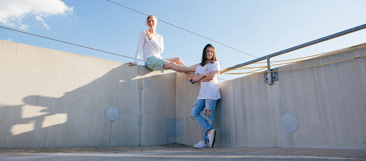
If you’re taking a photo with straight lines or a horizon, it is always a good idea to line this up with one of the edges on your photo so that it may run parallel to it. It is overly distracting to look at a beautiful photo that hasn’t been lined up properly. It makes the photographer look like someone who just got lucky with the subject matter and camera settings, but still somehow managed to not hold the camera perfectly level and letting the entire image slant to the side. It is always possible to crop and realign the photo in post-production, however it is a good idea to make a habit of lining up your photos when you take them.

3. Rule of thirds
The rule of thirds is important when you need to decide how much space each element should be allowed to take up in your photo (choosing where your subject should appear in the photo in relation to its surroundings). This gives your eyes something to look at, and it puts the subject into context with enough of its surroundings to tell a story. If you’re taking a landscape photo, try to place any defining objects, house or hill at about a third into the photo from the side, top or bottom. You can try doing this with portraits or product photography as well to build up your confidence.

4. Light source
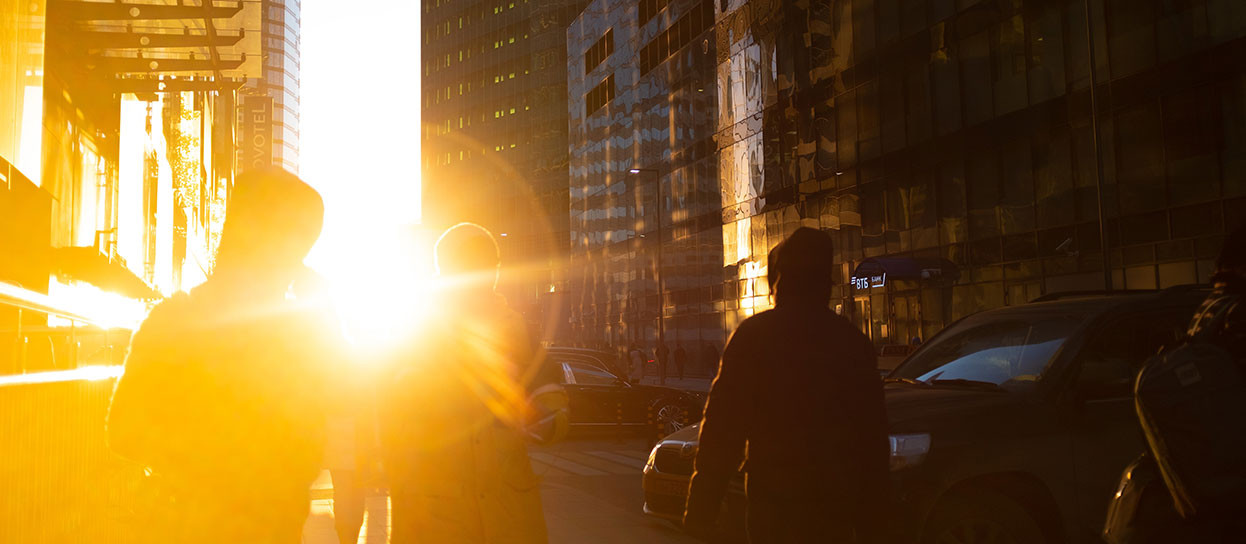
Light coming in from different angles can make the same photo look drastically different. You could take a photo of someone with the sunset behind them, thus creating a dark silhouette with very little visibility of their face. Or with the sun behind the photographer and shining directly onto the face of the person you’re taking a photo of. Both photos will yield different results even when taken at the same time of day. If you choose to take a photo in the middle of the day (or in a very bright light) beware of over exposed and under exposed sections in your photo as the harsh light could cast strong shadows. Early morning and late afternoon are good times to take photos in softer light. If you’re using artificial lighting indoors, try to diffuse the light or use a bigger light source. The bigger the light source – the softer the light.

5. Point of interest
Choosing a point of interest is as much choosing what to include, as well as what to exclude from the photo. Be sure not to add too many points of interest as this may become confusing and your subject won’t stand out or capture your attention. It may help to take a few photos and reviewing them to give yourself a feel for which photo looks better. This helps as you can see the entire scene with your naked eye but need to see what it looks like on a photo – cut out from its surroundings.

6. Balance and Symmetry
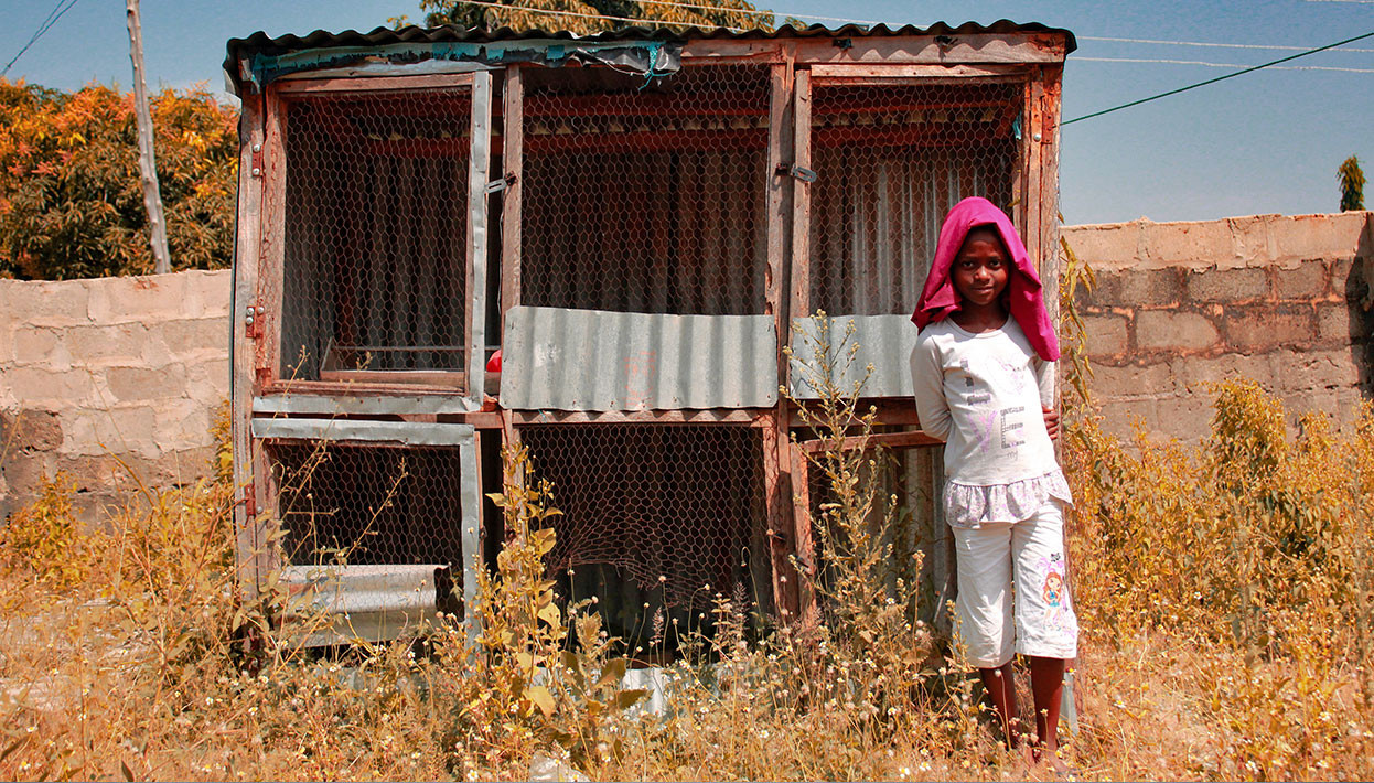
You can bring balance to your photo in various ways. You could use contrast between light and dark areas, include foreground or background elements, or make use of empty vs busy space. This could be represented through things like a field in front of a detailed mountain, or a portrait shot taken through the frame of a door. If both sides or the top and bottom of the scene looks similar (like pointing your camera down a long straight road) it is pleasing to the eye to place the middle point in the middle of your photo. It brings balance and doesn’t distract the viewer and is much more pleasing to look at since there is perfect balance on both sides of the photo.


